The artists of De Stijl were visionaries. Appalled by the horrors of war, these avant-garde artists sought to establish a new society. De Stijl envisaged a universal language that was neither representational, narrative, nor illustrative. Painting was but one aspect of their creative, revolutionary enterprise. The artistic community embodied architects, philosophers, poets, painters, designers, and composers. The name Piet Mondrian is synonymous with De Stijl, as is the innovative chair designed by Gerrit Rietveld. Perhaps less renowned but no less original are the paintings and architectural designs by Theo van Doesburg, the musical compositions by Jakob van Domselaer, the paintings by Bart van der Leck and Vilmos Huszár, the architecture by J.J. Pieter Oud and Jan Wils, and the groundbreaking kitchen designs by Piet Zwart.
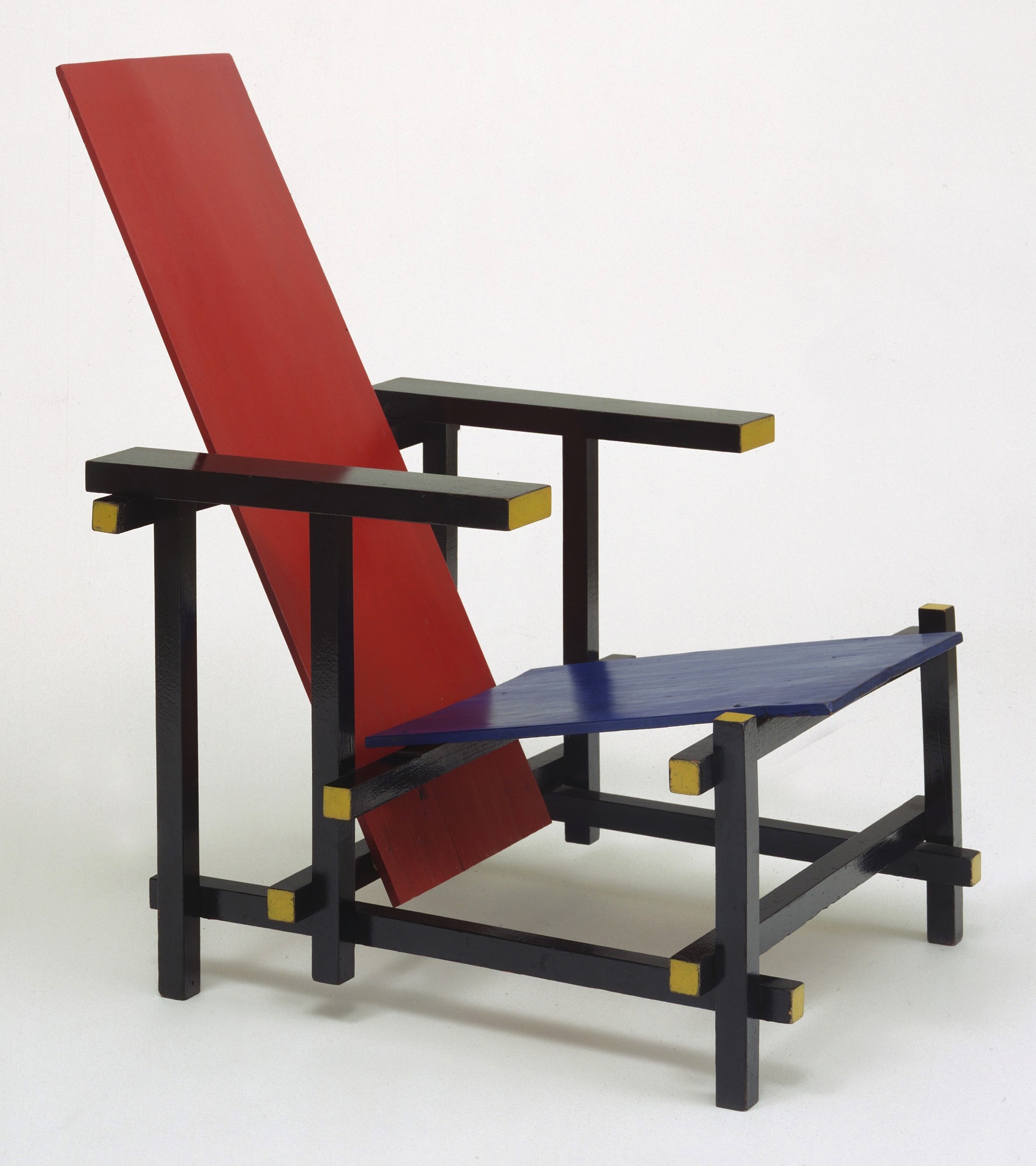

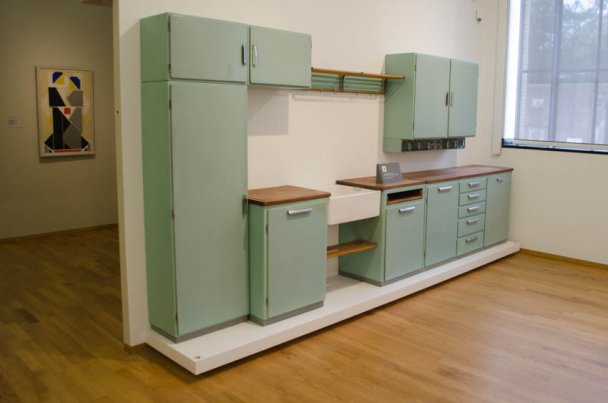
Left: Gerrit Rietveld, Red Blue Chair – 1918-1923 – MoMa Centre: J.J. Pieter Oud – architect –Photo of Café De Unie – Rotterdam Right: Piet Zwart – Design for the Bruynzeel Kitchen; in the background a painting of a dancing couple by Vilmos Haszár
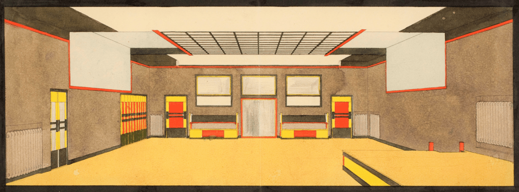
If you Google the name Piet Zwart (1885 – 1977) you will be directed to a multi-functional designer, from interior design to furniture, crockery, typography, and his pioneering kitchen designs for the Bruynzeel company. Together with Jan Wils, he composed a design for the interior of a dance studio. The typical De Stijl elements are unequivocal: explicit geometrical shapes, straight lines, a basic colour scheme, bold colours, clarity, and balance. There is no overt ornamentation but a pronounced, continuous red border framing the ceiling and geometric fixtures. The organised relationship of space, colour, and form culminates in a harmonious whole.
But how to compose dancers with only squares, rectangles, and the occasional diagonal line? How far can an artist eliminate emotion and narrative when portraying dance? And how to represent dance when artists decide to abandon the differentiation between negative and positive space? Dance themes and dance-inspired images are periodically found in Van Doesburg’s and Huszár’s work. Mondrian’s work, recurrently dance-related, was influenced by his enthusiasm for jazz music and popular social dances. These artists, together with Willem van Leusden and Piet Zwart, were trailblazers, innovators of an unprecedented portrayal of dancing figures.
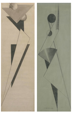
Piet Zwart designed two dance-related figures: a figure modelling a dance costume and a second gouache of a dancer wearing a remarkably similar costume. The image Dance Costume, comprised of multi-coloured geometrical forms and shapes, remains recognizable as a female dancer. Zwart has used a semi-circular line to depict her face, given her cylindrical-shaped head, oval-shaped eyes, and, though giving an angular impression, her wrists essentially have a delicate curve. These ‘natural’ features have vanished in Dancer. The image, though still recognizable as a dancing human figure, is exclusively composed of rectangular shapes. The only exceptions are the triangular shapes used for the feet and the deviating contours used for the hands. The dancer is sharp-cornered, shown sideways, with her torso and hips facing the front. She reminds me of an Egyptian mural. Bizarrely, perhaps unintentionally, she appears to dance on tiptoe, not unlike a ballerina on pointe.
The colour scheme of the two images is similar: pastel pink, mauve, light green, and yellow. And you will have noticed, the black plane is under no circumstances merely the background, but functions as an integral part of the dancer and the dancer’s costume; the background and foreground are on one plane and are interwoven.
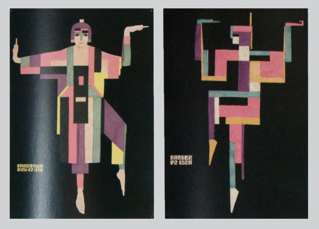
L: Costume Design – 32.6 x 22.3 cm – 1920
R: Dancer – gouache on paper – 1920
Willem van Leusden (1886-1974), never an official member of De Stijl but closely associated with the group through his friendship with Gerrit Rietveld, composed dance images using geometrical forms. The two black chalk drawings, Study of a Dancer and Dancer, totally dehumanize the dancing figure. The left drawing shows van Leusden playing with triangles of various dimensions while simultaneously lengthening the configuration. The receding black triangles create an impression of depth. Here, as in the second drawing, van Leusden has added two circular shapes. The second image, also composed within an elongated vertical rectangle, plays with light and dark hues, circles, curvilinear forms, and an off-balance fan-like shape. In these works, van Leusden’s specific use of space, depth, circularity, and the positioning of geometrical shapes is uncharacteristic of De Stijl; both drawings demonstrate a particular affinity to constructivism.
Study of a Dancer – 1922 – Christie’s
A Dancer – 1922- 73.5 x 26 cm black chalk on paper – Christie’s / Simonis Buunk
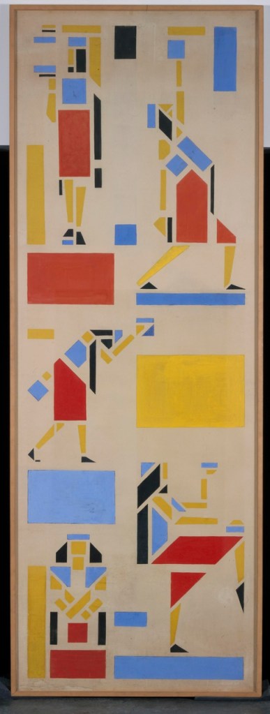
In contrast, the colourful design below is definitely characteristic of De Stijl. The artist limits himself to primary colours, arranging geometric forms, like playing blocks, into recognizable patterns. This design, intended for a mural for a dancing institute, brings the work of Bart van der Leck to mind. Bart van der Leck, whose only dance images were painted prior to the formation of De Stijl, was known to deconstruct an existing identifiable figure into small and smaller geometrical shapes to be reassembled into a schematic representational figure. In this way, his artistic approach differs from that of Mondrian and van Doesburg; quite probably, Van der Leck was influenced by his early training, in Utrecht, as an apprentice in a stained glass workshop.
I can imagine this long, bright mural being an extraordinary decoration in any dance studio. With a panel of nearly three meters in length, each configuration is striking. The upper and lower static dancers on the left side of the panel are notable; especially the lower-seated figure that demands acknowledgment. The other three dancers, though disconnected, are totally convincing movers. That centre figure on the left flank, constructed from squares, triangles, pentagrams, parallelograms, and other irregular rectangular shapes, could, with a little imagination, be dancing an indigenous rain dance. And the two figures on the right flank, separated by an impressive yellow rectangle, have, to my mind, an Oriental or Arabian flavour. Similar to Piet Zwart and Bart van der Leck, van Leusden establishes no distinction between negative and positive space. The design is two dimensional; the monochrome surface is assimilated into each schematic configuration.
Piet Zwart and Willem van Leusden only left these dance images. Both artists, each with their own specialties, were prominent Dutch artists. In the works by Theo van Doesburg, Piet Mondrian and the Hungarian/Netherlands Vilmos Huszár, however, the dance theme regularly recurred. The following posts will discuss their work more extensively; for now, a brief introduction.
One of the founding members of De Stijl, Vilmos Huszár (1884-1960), was not only a painter but an equally accomplished sculptor, draftsman, and graphic designer. In 1917, together with Theo van Doesburg and Piet Mondrian, he founded the De Stijl movement. In Composition II, a work from 1917, evidently influenced by Bart van der Leck , Huszár eliminates the difference between foreground and background. The sixteen block figures, each composed of seven rectangles, all have the same pattern of colouring. The head is a black rectangle (at times looking more like a square), the torso is formed by a larger green rectangle, and the limbs and feet by, respectively, red and black blocks. At this stage in his career Huszár, experimented with colour, space, and dimensions using schematic representations of existing objects. Why Composition II enjoys the sub-title Skaters is more than obvious.
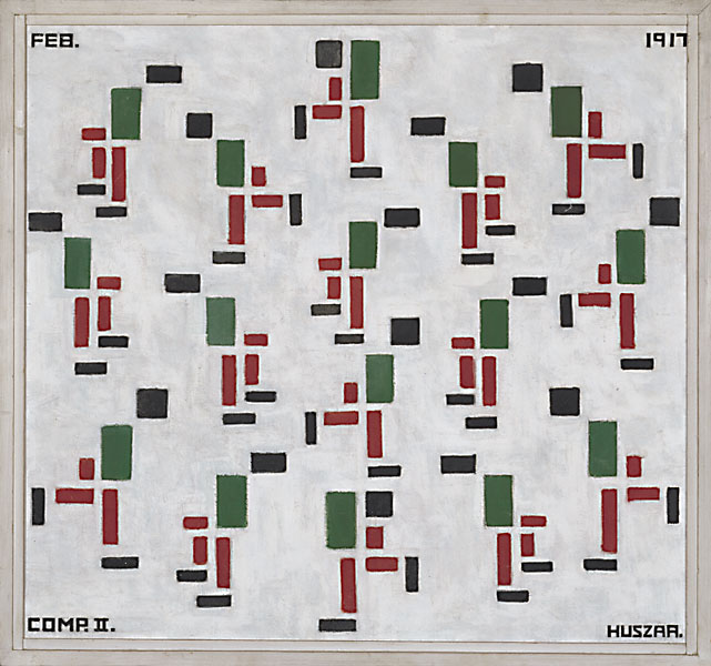
Admittedly, Composition II (Skaters) is not a real dance image, but I feel justified for this detour because skating is dancing on ice, and this intriguing painting illustrates how Huszár, experimenting with schematic forms, has captured the dynamism of the energetic skaters. I will look at his actual dance images in a following post, exploring not only his dancing couples but also his enthralling mechanical dancing figure.
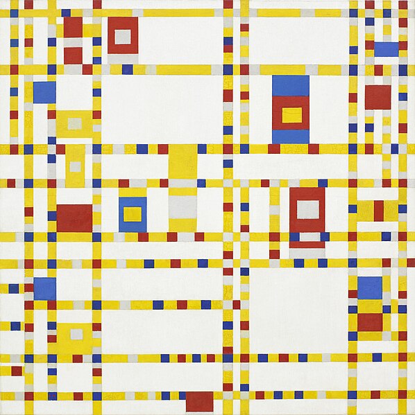
Now to turn to Piet Mondrian, celebrated for his abstract paintings using the primary colours red, yellow, and blue, composed in a grid of horizontal and vertical lines. His works are non-representational, an abstract plane fusing primary colours and space to form a unified harmony. Contemporary photographs of Piet Mondrian leave, just like his paintings, an uncompromising impression. However steadfast he appears to be, Mondrian was, in fact, an ardent enthusiast of jazz music and an avid dancer, dashing onto the dance floor at every opportunity. He danced all the popular dances of the time: the charleston, quick step, and tango. He also idolised the famous Folies Bergère dancer Josephine Baker, even hanging photographs of this iconic performer on the walls of his otherwise austere Parisian studio.
Contrary to the paintings already discussed, Mondrian dance images contain no dancers, no schematic dancers, or any suggestion, however stylized, of a physical dancer. His non-representational, non-narrative, and non-illustrative dance-related images derive from the very essence of the dance itself: tempo, rhythm, spatial design, and movements. A painting such as Broadway Boogie Woogie is naturally open to interpretation, but inescapable is the intense sensation of the hustle and bustle typical of Broadway and the rhythm, dynamics, fluctuations, and swing so unique to the effervescent Boogie Woogie.
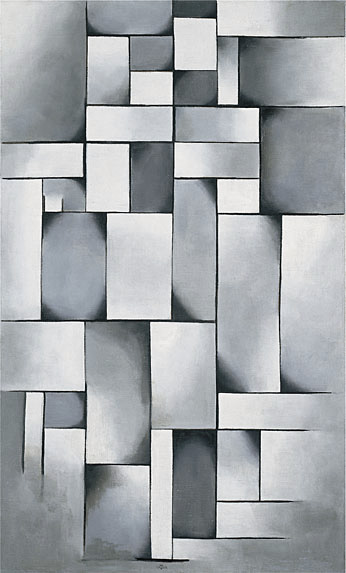
Theo van Doesburg, the driving force behind De Stijl, often developed a new work from a realistic representation of an existing figure. Following a careful process of modification and elimination, the original figure evolved, step by step, into an abstract work. Composition in Gray (Ragtime) is the end result of this process. It is housed in The Peggy Guggenheim Collection.

Composition in Gray (Ragtime) – oil on canvas – 96.5 x 59 cm – 1919 – Peggy Guggenheim Collection, Venice
…the man is on the right, his foot firmly planted at the bottom of the composition, his left arm raised at shoulder level. The woman, slightly shorter, performs a rag-time kick (the two vertical parallel lines in the lower left quadrant are her foot—this is a back kick from the knee). Her waist is located in the shaded oval-in-a-rectangle half way up the left side of the composition
The Peggy Guggenheim Collection, Venice
The above description, with thanks to The Peggy Guggenheim Collection, provides a rather explicit explanation of this monochromatic abstract work. To my mind, the painting, subtitled Ragtime, certainly reflects the syncopated rhythm of the ragtime, but it takes quite an amount of imagination to visualize a man on the right with his arm specifically placed at shoulder level or his partner performing a kick. But how do you explain this detailed description? You have already guessed. Van Doesburg worked from a preliminary sketch. This gouache is approximately the same size as the final composition. In a letter to a friend, van Doesburg explains that he executed more preliminary sketches. Only this sketch has been preserved.
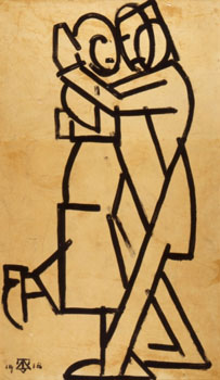
Study for Composition in Gray (Ragtime) gouache on paper – 96.5 x 55.5 cm – 1918 – Kröller-Müller Museum, Otterlo
Composition in Gray (Ragtime) – oil on canvas – 96.5 x 59 cm – 1919 – Peggy Guggenheim Collection, Venice
The three iconic exponents of the Stijl, Huszár, Mondrian, and van Doesburg, were each fascinated by different aspects of dance. These innovative artists visited and revisited dance in a variety of ways during their careers. In the following posts, I will attempt to shed some light on how these artists visualized dance and how their visionary ideas complemented music and dance.
